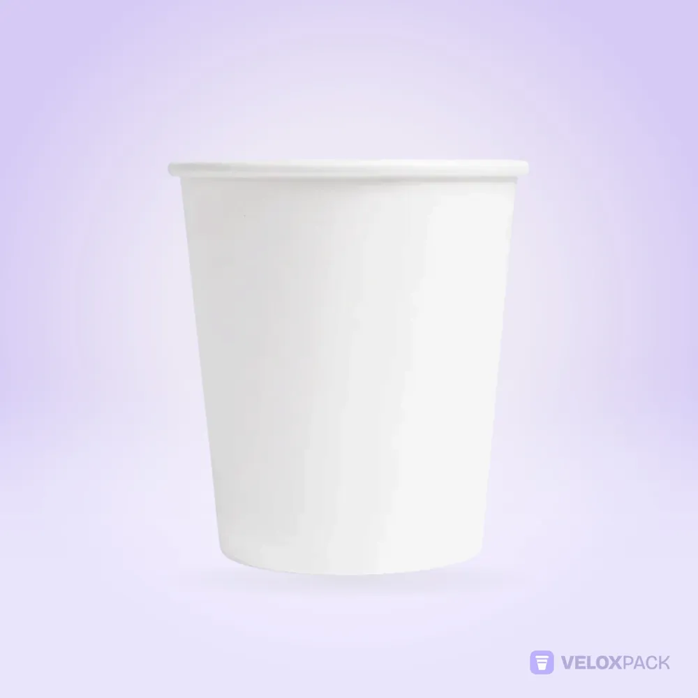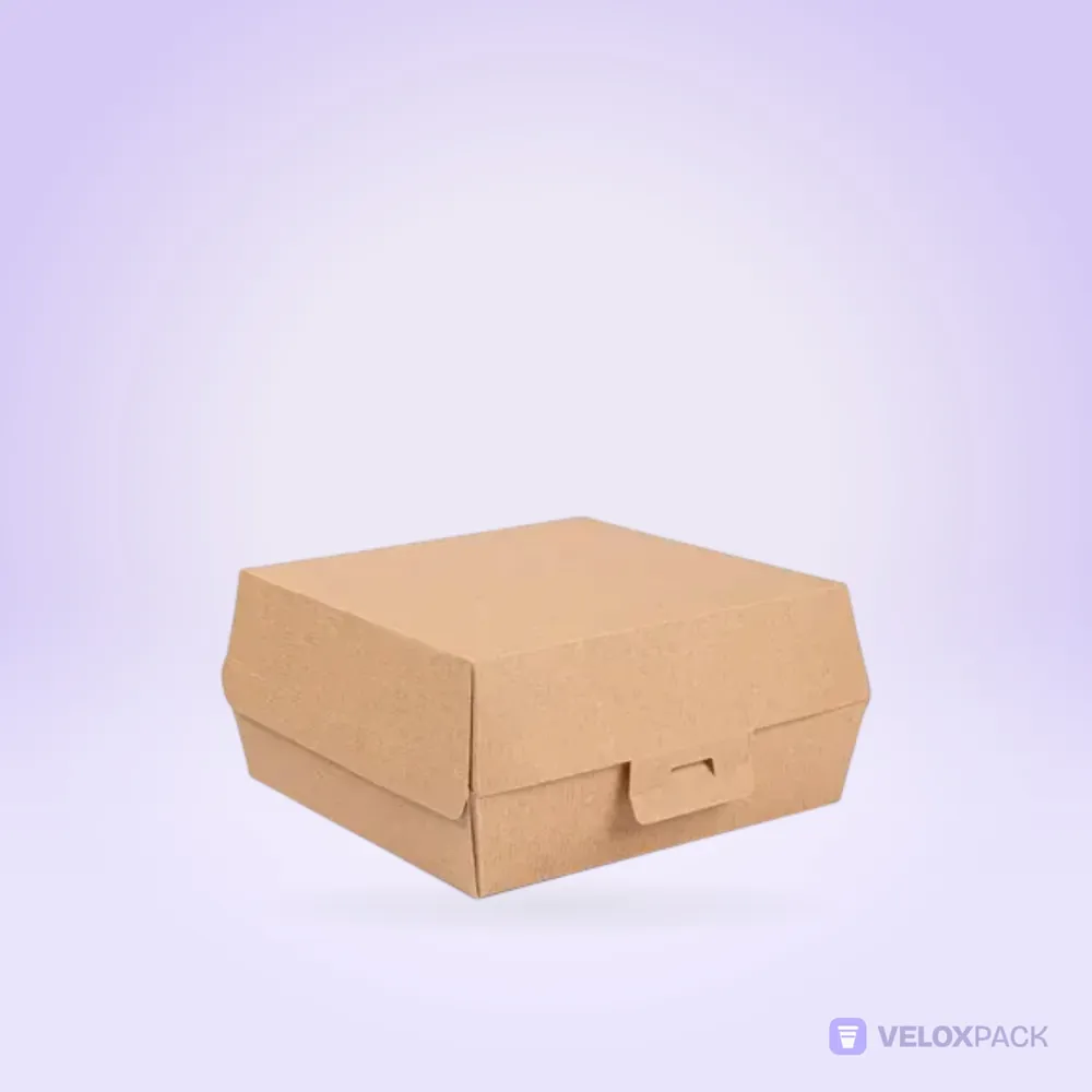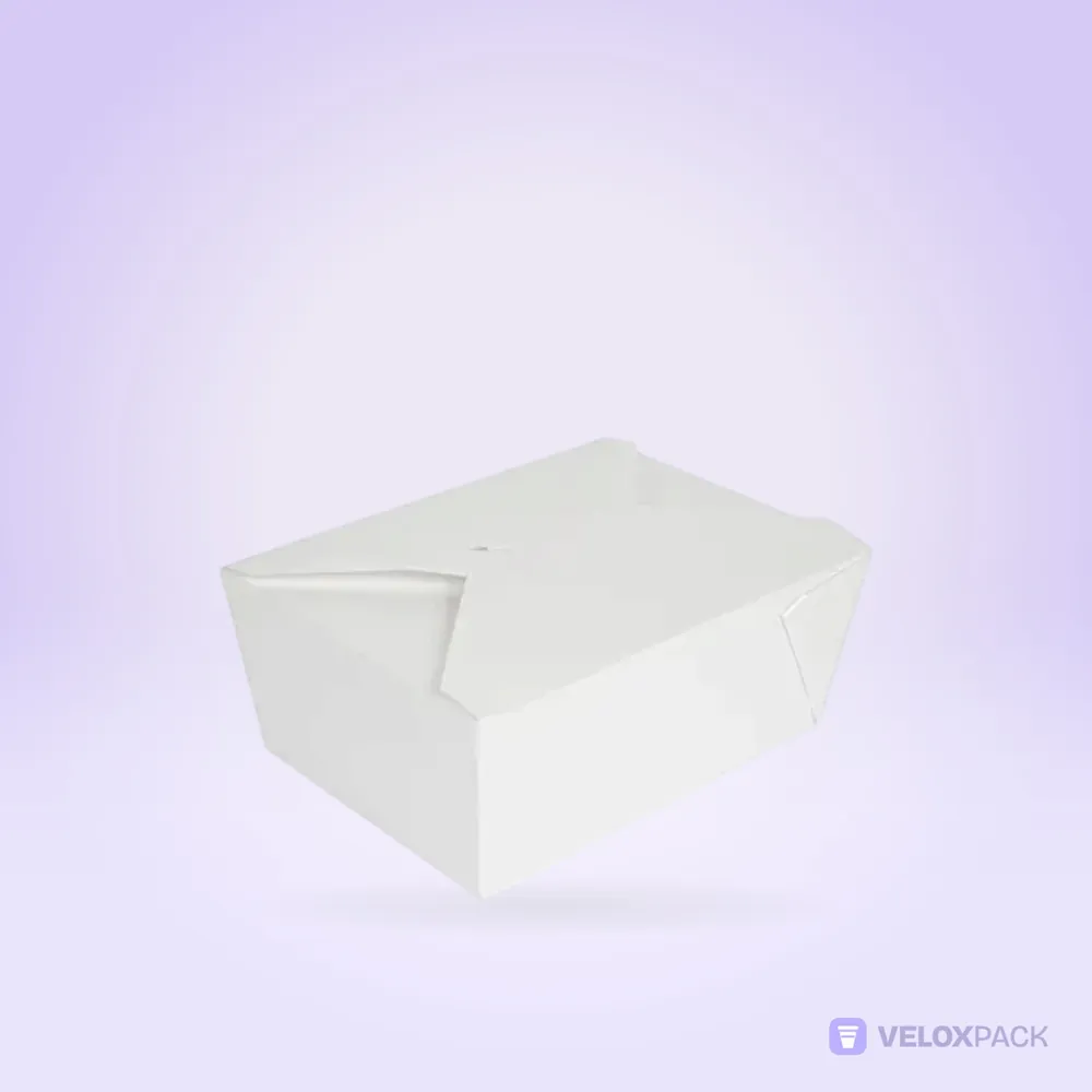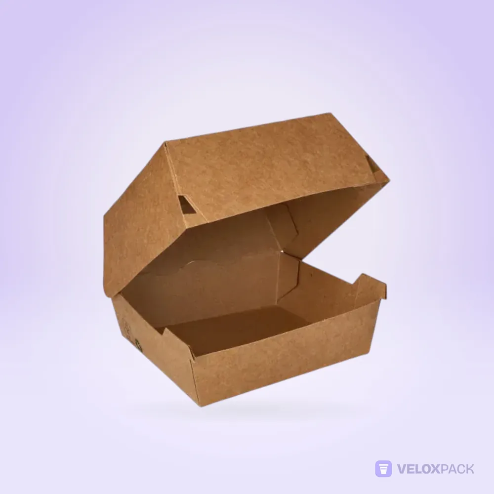
A logo that looks great on screen can look quite different on the curved surface of a cup or the brown background of a kraft box. Good packaging print starts with artwork prepared for the surface it will be printed on. This guide gives you a practical checklist to run through before ordering printed cups or boxes.
1. Start with the right file format
We accept PDF, AI, SVG, PNG or JPG files for printing, but they are not equal when it comes to print quality:
| Format | Type | Suitability for print |
|---|---|---|
| AI, PDF, SVG | Vector | Best choice; stays sharp at any size |
| PNG | Raster | Usable if high resolution |
| JPG | Raster | Last resort; no transparency, may show compression artefacts |
A vector file defines your logo with mathematical paths, so it stays crisp whatever size it is printed at. If all you have is a small PNG taken from your website, ask the designer or agency that created your logo for the original vector file. A low-resolution image can print blurred.
2. Choose the number of colours deliberately
The number of colours affects both the look and the cost. As a general rule:
- One-colour logo: clear, simple and usually the most economical option.
- Two or three colours: enough to carry most brand palettes.
- Many colours, photos or gradients: can look striking, but cost and print method are assessed separately in the quote.
If colour consistency matters to your brand, share your Pantone references with the artwork. Screens display colour in RGB, while print works differently, so the same colour can look different on screen and on board. Any difference is resolved at the proof stage.
3. For cups: curve and seam
A paper cup is made by cutting a flat blank of board and wrapping it into a cone. That has two consequences.
The seam
Where the two ends of the blank meet there is a vertical seam. A logo, text or key graphic that lands on the seam looks split in two. Place your main logo on the opposite side.
The conical shape
The cup widens towards the top. A graphic designed as a flat rectangle appears slightly arched on the cup, so cup artwork is prepared on an arc-shaped template rather than a plain rectangle. You see and approve the placement on the print proof.
How many times to repeat the logo
If you want the logo visible whichever way the customer holds the cup, placing it twice, on opposite sides, is a common approach.
4. For boxes: folds and panels
Products such as the burger box, noodle box or meal box are made by cutting and folding a flat sheet of board.
- Watch the fold lines. A logo that crosses a fold looks broken.
- The lid panel is the main stage. The top of the box is usually the most visible area, so put the logo there.
- Leave a safe margin at the edges. Cutting and folding have small tolerances; keep text and logos away from the edges.
Printed boxes start from 50,000 pieces, so it pays to plan artwork that works across several box sizes.
5. Colours behave differently on kraft
Kraft board is brown, and ink sits on top of that brown background. The result:
- Light colours look faded. Yellow or pale pink are hard to read on kraft.
- Dark colours work well. Black, dark green, navy and burgundy stay crisp on kraft.
- If you need a white area, mention it at the quote stage; printing white on a coloured base is assessed separately.
White bristol board shows colours brighter and closer to what you see on screen.
6. Type size and legibility
- Your brand name should be readable from a few metres away.
- Keep secondary information such as a web address, social handle or slogan short.
- Very thin typefaces and very small type can disappear in print.
- Try not to use more than two type families on one piece of packaging.
7. Think across the whole product family
Cups, lids, boxes and sauce pots often end up in front of the same customer. A single rule for logo placement and one colour palette keep the look consistent across products. A café, for example, will often use a scaled version of the same design on its 8, 12 and 16 oz cups.
Common design mistakes
- Using the website logo. It is usually low resolution and not suitable for print.
- Too much information. Address, phone, menu, slogan and every social handle on one cup looks cluttered. One main message and at most one secondary detail is enough.
- Fine lines and tiny details. Thin lines that look crisp on screen can disappear or thicken on board.
- Ignoring the base colour. The same design looks very different on white and kraft; choose the board before finalising the artwork.
- Rushing the proof. Check spelling, colours and logo position separately. Changes after approval slow the process down.
Pre-print checklist
- Is the logo in vector format (AI, PDF or SVG)?
- Are the Pantone references for brand colours defined?
- Is the logo clear of the cup seam and the box fold lines?
- If kraft is chosen, are the colours dark and high-contrast?
- Is the smallest text legible?
- Is it clear who will check and approve the proof?
Frequently asked questions
Which file format is best for printing?
Vector formats (AI, PDF, SVG) give the best result. PNG and JPG are accepted too, but they need to be high resolution.
Can I see how my logo will sit on the cup before production?
Yes. We prepare a print proof before production and send it for your approval. Production does not start without your approval.
Can a white logo be printed on a kraft box?
That depends on the print method. Mention it at the quote stage and we will look at the available options with you.
Can I use the same design on cups and boxes?
Your logo and palette can stay the same, but the layout is adapted to each product's shape. A separate print proof is prepared for each product.
Is the printing plate fee charged on every order?
A printing plate fee applies to printed items. How repeat orders are handled is stated in the quote.
Send us your artwork
Share your logo and the products you want printed, and we will work out placement and print options with you. Request a quote or send your file to info@veloxpack.com. For the full ordering process, read our custom printed paper cups guide, and browse printable products in the cups and boxes categories. Suggestions for cafés are on our cafés page.